


Hello, I'm Alex, the creator of the online course on commercial art. I wrote this article myself, based on my long experience. I did my best to tell you clearly and to the point about the most common problems and how to solve them. These problems are faced by all designers, without exception.
To save a lot of your time in the future to solve these problems, I suggest you familiarize yourself with this material. The article was written mainly for buyers of my online course "Commercial ART. Photoshop course from 0 to PRO". This material will always be at hand, and will help you in the future, if you forget something. This article will also be useful for ordinary Adobe Photoshop users.
In the full course there is a lot of structured information that you will not find in the open access. It took our team of 5 people more than 18 months to design and release this course. If you purchase a course, you will gain my 8-year experience in just 2 weeks of practice. And it's worth it. More details.
Some of the topics of the article may not be clear to you, so, for your convenience, I suggest using this helpful navigation:
1. What power should the computer/laptop have?
2. How much free memory do I need on my computer to work with art?
3. Color space. Why is it better to watch the final art on the iPhone screen?
4. Which monitor or laptop screen is needed to draw?
5. What is the best graphics tablet for drawing art in Photoshop?
6. Color space in Adobe Photoshop
7. Creating a file in Photoshop - analyzing the parameters in detail
8. The client sent files (images) in WebP, HEIC and DNG format. How do I open them?
9. The circle of the brush or eraser is not displayed in Photoshop
10. How to increase the number of steps back (Ctrl + Z) in Photoshop
11. In what format is it better to save art? PSD, JPEG, JPG, PNG, TIFF, GIF?
12. Correct saving of art in the RGB/sRGB color profile in JPG
13. How to correctly convert art from the sRGB color range to CMYK for printing
14. Color correction of the converted CMYK file
15. Saving art for printing
16. What common mistakes do students of my course make? – Analysis
Solving 16 most common problems that people face when working with Adobe Photoshop
Solving 16 most common problems that people face when working with Adobe Photoshop

Hello, I'm Alex, the creator of the online course on commercial art. I wrote this article myself, based on my long experience. I did my best to tell you clearly and to the point about the most common problems and how to solve them. These problems are faced by all designers, without exception.
To save a lot of your time in the future to solve these problems, I suggest you familiarize yourself with this material. The article was written mainly for buyers of my online course "Commercial ART Photoshop course from 0 to PRO". This material will always be at hand, and will help you in the future, if you forget something. This article will also be useful for ordinary Adobe Photoshop users.
In the full course there is a lot of structured information that you will not find in the open access. It took our team of 5 people more than 18 months to design and release this course. If you purchase a course, you will gain my 8-year experience in just 2 weeks of practice. And it's worth it. More details.
Some of the topics of the article may not be clear to you, so, for your convenience, I suggest using this helpful navigation:
1. What power should the computer/laptop have?
2. How much free memory do I need on my computer to work with art?
3. Color space. Why is it better to watch the final art on the iPhone screen?
4. Which monitor or laptop screen is needed to draw?
5. What is the best graphics tablet for drawing art in Photoshop?
6. Color space in Adobe Photoshop
7. Creating a file in Photoshop - analyzing the parameters in detail
8. The client sent files (images) in WebP, HEIC and DNG format. How do I open them?
9. The circle of the brush or eraser is not displayed in Photoshop
10. How to increase the number of steps back (Ctrl + Z) in Photoshop
11. In what format is it better to save art? PSD, JPEG, JPG, PNG, TIFF, GIF?
12. Correct saving of art in the RGB/sRGB color profile in JPG
13. How to correctly convert art from the sRGB color range to CMYK for printing
14. Color correction of the converted CMYK file
15. Saving art for printing
16. What common mistakes do students of my course make? – Analysis
1. What power should the computer/laptop have?
If you already have a computer or a laptop, then try installing Adobe Photoshop on it, and work with my lessons. If you notice that the computer/laptop is slowing down, then it's time to change it already. You will find recommendations for the most budget-friendly assembly at the bottom of this large article.
2. How much free memory do I need on my computer to work with art?
To work with art, you need at least 30 GB of free hard disk space, because Photoshop uses a lot of memory for temporary (cache) files while working with files.
3. Color space. Why is it better to watch the final art on the iPhone screen?
The topic of the correct display of colors is very complex, but at the same time it is very important. We want to achieve the correct display of colors on your screen so that the human skin on the art is not too red or too blue, and the art looks bright and vivid. Our research has shown that bright and vivid pictures always attract more attention, because of this, the number of orders is also growing.
The pictures on the Internet that surround us are displayed in the sRGB color space. Creating web art is our priority, so we will first change the color profile of monitors in operating systems to sRGB.
Instructions for Windows: https://support.microsoft.com/... Add the sRGB IEC61966-2.1 profile and make it the default. Restart the laptop/computer.
Instructions for Mac: https://support.apple.com/... the default color profile should be Apple RGB.
Next, we need to adjust the correct color rendering of colors in the monitor. I recommend using this instruction:
The drawn art is best viewed for color correction errors on the screen of an Apple smartphone*. 90% of computer and laptop monitors do not transmit skin color well enough, and a person's skin may turn out to be the color of a blue corpse, or vice versa, a person will be red like a tomato. Therefore, before sending the work to the client, I advise you to view the art on your smartphone. You can send the art to yourself via Facebook messenger, via the smartphone's file system, or with a link via Google Drive (the best option).
If you think that you have calibrated the monitor well, then you needn't do these actions after the tenth art done.
If you notice a strong color deviation and you can't calibrate the monitor, then I recommend that you change the monitor. For more information, see Paragraph 4.
Starting with the iPhone 7, Apple devices have very well-calibrated screens that transmit accurate color reproduction, and the human skin on the art looks like on an expensive monitor that would cost $800-$1500. As for other smartphone brands, it is very difficult to say how correctly their screens are calibrated.
If you already have a MacBook no older than 5 years, with Apple RGB color space, then you don’t have to worry, the screen is good enough, and this instruction is not needed.
The topic of the correct display of colors is very complex, but at the same time it is very important. We want to achieve the correct display of colors on your screen so that the human skin on the art is not too red or too blue, and the art looks bright and vivid. Our research has shown that bright and vivid pictures always attract more attention, because of this, the number of orders is also growing.
The pictures on the Internet that surround us are displayed in the sRGB color space. Creating web art is our priority, so we will first change the color profile of monitors in operating systems to sRGB.
Instructions for Windows: https://support.microsoft.com/... Add the sRGB IEC61966-2.1 profile and make it the default. Restart the laptop/computer.
Instructions for Mac: https://support.apple.com/... the default color profile should be Apple RGB.
Next, we need to adjust the correct color rendering of colors in the monitor. I recommend using this instruction:
4. Which monitor or laptop screen is needed to draw?
If you already have a monitor or laptop, then at the first stages of drawing art, you can use the instructions from the 3rd point and not spend money on buying new equipment. There is a lot of information about the choice of monitor It's best to watch this video:
Also, this information is relevant when choosing a laptop screen.
What you should pay attention to: the sRGB color transfer of the screen should be from 96% and higher.
What you should pay attention to: the sRGB color transfer of the screen should be from 96% and higher.
5. What is the best graphics tablet for drawing art in Photoshop?
In my lessons, I show how to draw hair, skin and other elements of art with a computer mouse, and also show how to draw them using a graphics tablet. It's a little easier to do this on a graphics tablet than with a mouse. If you don't have money for a graphics tablet, then draw skin and hair with the mouse until you obtain a graphics tablet.
There are a lot of models of graphics tablets on the market, but many tablets have huge problems with the installation and operation of drivers.
In my experience, I have tried a lot of graphic tablets from Chinese brands, and still switched to the Japanese brand from Wacom. This is not a brand advertisement, but a real use experience. For the average and novice designer, inexpensive medium-sized tablets of the Wacom One series without a screen are suitable. The drivers from Wacom work fine on Windows and Mac OS. If you already have a graphics tablet from another brand and it works well, then you do not need to change it.
The main problems of Chinese brands:
-Drivers with new operating systems do not work.
-There is a problem with a screen resolution of more than 1080 by 1920 pixels.
-Some built-in buttons don't work
-The pressure sensor does not work correctly
-Loss of connection after restarting the computer/laptop
6. Color space in Adobe Photoshop
On the Internet you can read about different color spaces and how a separate technology works. To avoid stretching the article, I will briefly write what you need to know to create art. In Photoshop, we work in the RGB/sRGB color space (the finished result is always sRGB). In this color space your art will look best on any social networks and websites. The art is saved in JPG format. Read more about file formats in Paragraph 11.
Art for printing:
Next, when we have made a duplicate of the art (JPG file), we change the Photoshop workspace into the CMYK color range, which is intended for printing. According to the color palette, the CMYK color range is much paler than RGB / sRGB, so art sometimes needs an additional small color correction to increase brightness and adjust colors. For more information about RGB -> CMYK conversion, see Paragraph 13. We save the file in TIFF format. Read more about file formats in Paragraph 11.
Please note that not all clients remember that they need to print art in TIFF format and can pass a JPG file to the printing office, whereas most printing houses convert the art themselves into conditionally normal colors, provided that you clicked the sRGB check mark when saving the file. Learn more about saving web art in Paragraph 12.
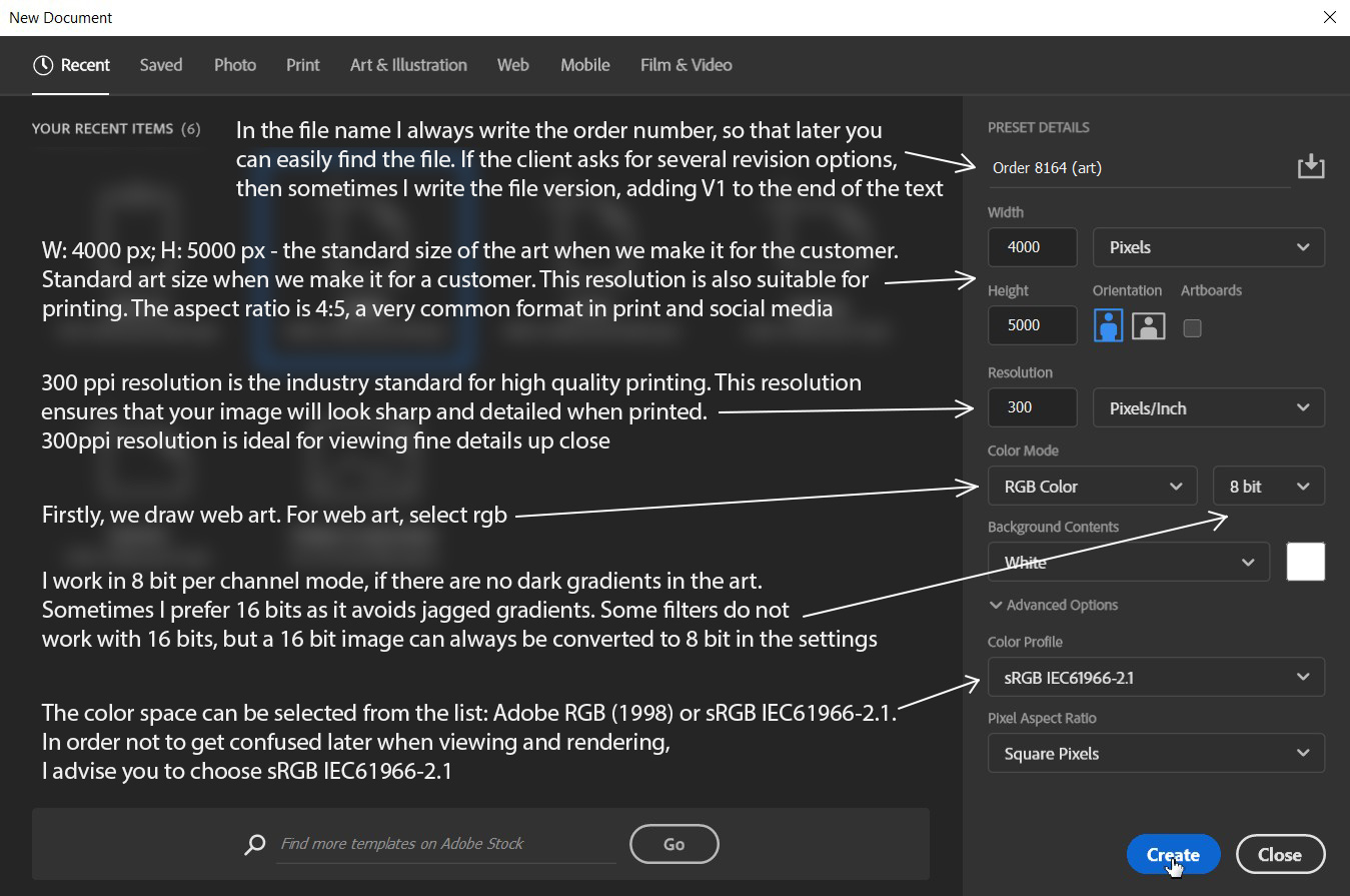
7. Creating a file in Photoshop - analyzing the parameters in detail
I work in 8 bit per channel mode, if there are no dark gradients in the art. Sometimes I prefer 16 bits as it avoids jagged gradients. Some filters do not work with 16 bits, but a 16 bit image can always be converted to 8 bit in the settings.
The color space can be selected from the list: Adobe RGB (1998) or sRGB IEC61966-2.1. In order not to get confused later when viewing and rendering, I advise you to choose sRGB IEC61966-2.1.
Make sure that your working environment is displayed as sRGB IEC61966-2.1:
The color space can be selected from the list: Adobe RGB (1998) or sRGB IEC61966-2.1. In order not to get confused later when viewing and rendering, I advise you to choose sRGB IEC61966-2.1.
Make sure that your working environment is displayed as sRGB IEC61966-2.1:
If you have set 16 bits mode and some filters do not work for you, then you can easily convert the file to 8 bits:
You can zoom in on the image with your fingers to read text on mobile.
You can zoom in on the image with your fingers to read text on mobile.
I work in 8 bit per channel mode, if there are no dark gradients in the art.
Sometimes I prefer 16 bits as it avoids jagged gradients. Some filters do not work with 16 bits, but a 16 bit image can always be converted to 8 bit in the settings.
The color space can be selected from the list: Adobe RGB (1998) or sRGB IEC61966-2.1. In order not to get confused later when viewing and rendering, I advise you to choose sRGB IEC61966-2.1.
Make sure that your working environment is displayed as sRGB IEC61966-2.1:
8. The client sent files (images) in WebP, HEIC and DNG format. How do I open them?
WebP - the WebP image format is increasingly common on the Internet, this format is needed for maximum compression of images so that they load faster on websites. Older versions of Photoshop (older than 2022) can't work with files of this format, so I recommend using free online webp -> PNG converters in the browser (for example: https://convertio.co/...), which will convert your images from webp to PNG. As an alternative, Adobe offers to download the plugin: https://helpx.adobe.com/...
HEIC is a photo format in which Apple smartphones take photos. Clients very often send photos in this format via email. This file format is not supported in Photoshop, so we need to use any online HEIC -> JPEG converter. I often convert images on this site: https://convertio.co/.... Choose the maximum conversion quality in online converters, if your online converter has this function.
DNG (RAW) is a photo format that transmits more information compared to HEIC and JPEG files. DNG format allows for more flexible color correction of files. If you are interested in reading more about this format, here is the link: https://blog.adobe.com/.... Photoshop opens such files in a separate Camera RAW window. You can adjust the photos by color correction as you need, and click the «Ok» button or the «Open» button to open the photo for editing in the standard Photoshop interface. More about working with Camera RAW to prepare images for art is told in my course.
9. The circle of the brush or eraser is not displayed in Photoshop
If the circle (brush outline) is not displayed, then this problem is easy to solve. You just need to reduce the brush, for example, to 200 px, and if the contour does not appear, then press the Caps Lock key, thereby deactivating the operation of this key. Now the outline should become visible.
10. How to increase the number of steps back (Ctrl + Z) in Photoshop
There are 50 undo actions available in Photoshop by default. But in my practice, this number of cancellation steps is sometimes not enough, so I try to put about 400 cancellation steps. But at the same time, keep in mind that your memory on your computer or laptop will fill up more when working with a PSD file. You do not need to set the maximum number to 1000, as you will quickly run out of memory.
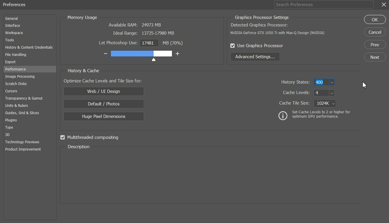
In the «History States» field, instead of the value 50, put 400
You can zoom in on the image with your fingers to read text on mobile.
You can zoom in on the image with your fingers to read text on mobile.
11. In what format is it better to save art? PSD, JPEG, JPG, PNG, TIFF, GIF?
I will not immerse you much in the theory of these formats. I will briefly tell you why I use different formats when fulfilling commercial orders.
PSD is the main file format for Photoshop, all layers of the image are saved in this format. After saving the PSD file, you can open it, for example, on another computer and continue editing layers, text and some filters that were previously applied. I also keep all PSD art files, even those that the clients approved. Sometimes it happens that the customer wants to make changes to the order in 1-2 months for an additional fee. Also, the PSD file conditionally confirms your copyright to art, and in case of theft of your art from social networks, you will be able to unquestioningly confirm your authorship.
When a client wants to make his corrections, he asks for a PSD file, and working with some companies involves transferring the PSD file for further editing.
Important Note: The PSD file does not save the previous steps from the last session in Photoshop. After opening the PSD file, you and your client will not be able to undo the actions by pressing Ctrl + Z, so try to leave as many layers in your art as possible just hiding them. Ctrl + Z can be applied only at new stages of editing in the current session. A PSD file with art can have an average weight of 50 megabytes to 900 megabytes, depending on the resolution of the file and the number of layers in the file. We use sRGB as the main color space.
JPEG (JPG) is the main format for saving web art for social networks and web sites. This format has a large compression ratio, which is why the image quality may be worse compared to a PNG file, which is especially visible with dark gradients. The advantage of this format is the weight of the file, which makes it easier to upload images to social networks with minimal file compression by the social network itself. I will tell you in Paragraph 12 how to properly save art for social networks. This file type has an average weight of 300 KB to 2 megabytes. We use sRGB color space.
JPG - the difference between JPG and JPEG is only in the letter «e». In practice, there are no differences when working with files of these formats. These are exactly the same image formats.
But why did two file extensions arise from the same format? It's very simple. In older operating systems, it was impossible to give a file extension a value containing more than three characters. In this regard, the JPEG extension was reduced to JPG.
PNG is the main file format if you want to keep transparency in the file (alpha channel) and publish the image on some web site. The PSD file also retains transparency (alpha channel), but the PSD file is technical with a huge weight and, unlike PNG, is not shown on websites. The PNG file has an average compression ratio and has an average weight of 1-5 megabytes. The PNG file conveys dark gradients very well, without the staircase effect (transitions between colors are less noticeable in contrast to a JPEG file in 16 bits). We rarely use this format to save art.
TIFF is the main format if we want to print art for the client. We also always give the client a TIFF file and indicate in the letter that this file is intended for printing. This format is used in printing all over the world, and provides the best color reproduction in print. The color space in Photoshop must be switched to CMYK. CMYK looks very dim compared to sRGB, so we do additional color correction of the art for the
CMYK color palette so that it looks as vivid as possible when printing.
After making the art, I advise from my experience to duplicate the JPG file with the sRGB color space, and switch the duplicated JPG file to the CMYK color space, and edit it for printing.
If we try to print a JPEG file (RGB), then most likely the person's skin color will be very pale, the colors of the art will be very dim, and the client will be very upset if he spends money on expensive printing in vain. So remember that we use only TIFF format for printing.
GIF – we do not use this format when saving art. This format is suitable for animated images. This format is similar to PNG, but it conveys color gradients very poorly and is not optimized in size.
12. Correct saving of art in the RGB/sRGB color profile in JPG
The stage of saving to Photoshop: File -> Export -> Save for Web -> Jpeg; Quality 80-100; Optimized; Convert to sRGB -> Save.
13. How to correctly convert art from the sRGB color range to CMYK for printing
There are several ways to convert the color range from sRGB to CMYK, but I will show my own developed technology so that your art is printed perfectly. Images converted in this way have always been very well printed in many printing offices.
Opening our JPG file with art in Photoshop!
Opening our JPG file with art in Photoshop!
You can zoom in on the image with your fingers to read text on mobile.
You can zoom in on the image with your fingers to read text on mobile.
You can zoom in on the image with your fingers to read text on mobile.
You can zoom in on the image with your fingers to read text on mobile.
You can zoom in on the image with your fingers to read text on mobile.
14. Color correction of the converted CMYK file
You can do basic color correction using the Image -> Adjustments tab... It's told in my lessons about the basic color correction of art, it is also relevant for the CMYK color range. You can work with individual color channels, select the desired color range for adjustment on them, and so on.… Each art is individually color-corrected to your liking. The main thing is that the art looks good on your calibrated screen. But a file in CMYK can't be edited in Camera Raw.
15. Saving art for printing
The stage of saving in Photoshop: File -> Save AS... -> On your computer (this item is only available in new versions of Photoshop) -> File type: TIFF -> Save.
16. What common mistakes do students of my course make? – Analysis
The analysis of errors in details will soon appear in the personal accounts of students. We are trying to add more visual examples. A full analysis of errors is already underway and a lot of material is being written. In this article we will briefly analyze the most common mistakes of my students.
1. The art looks very empty - you need to try to dilute the background with various elements, but at the same time, the main object in your art is always a person. The various elements in the background should not be too distracting.
2. Art turns into a mess of different colors – a very common mistake. Choose 2-3 main colors that will be in priority in the art, and try to stick to them. For example, my art from the first lesson is dominated by several colors: black, dark green and solid beige. And, for example, if we add some purple and yellow element to the background, then the art will turn into a mess of colors.
3. The skin color of a person is very red or very pale – here you need to first make the correct monitor setting, I'm telling you about this in the 3rd Paragraph. After the final color correction, always inspect the art for red/dark spots on the body, zoom in and out.
4. You check your art for errors when you are tired – you should never look at it for errors immediately after the full rendering of the art, and in no case send the art to the client if you checked the art with a tired look. I advise you to go drink tea or lie down to rest for 10-15 minutes, and only after that check your work for mistakes. When you work continuously for 1-3 hours, then your eyes begin to «blur».
Recommendations for the most budget laptop/PC assembly for working in Photoshop
Minimum characteristics for comfortable work:
The manufacturer of the laptop / PC is not important, nor is the special role of the Windows or Mac OS operating system important.
Laptop/PC on Mac OS:
Processor: M1 and higher (new generation arm). I5 and higher (old generation x86)
RAM (RAM) – at least 16 GB
SSD disk from 250 GB and above (in my experience it is better to take a 1Tb SSD disk)
Laptop/PC on Windows:
Processor – minimum 4 cores, and minimum 3 GHz frequency
RAM (RAM) – at least 16 GB
SSD disk (fast disk) for the system – from 250 GB and above (in my experience it is better to take a 1Tb SSD disk)
HDD disk (slow disk) for storing old files from 500 GB
Study the course "Commercial ART. Photoshop Course From 0 to PRO" and earn up to $19,000 per month by creating Commercial ARTs. On the course page there are video reviews from students who completed the course and began working with customers.
Alex A. instagram.com/deskillss
Author of the article / Author of the Photoshop course
Author of the article / Author of the Photoshop course

Alex A. instagram.com/deskillss
Author of the article / Ps course
Author of the article / Ps course